How to Avoid AI Slop in T-Shirt Design
Use a human-authored brief, deliberate art direction, and production editing to make AI-assisted shirt graphics feel specific rather than synthetic.
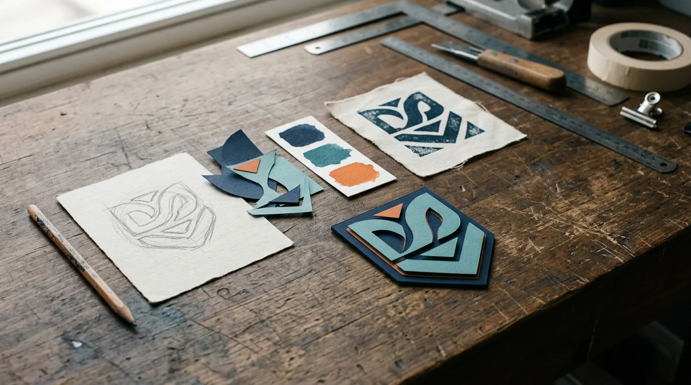
You can recognize the pattern before you can explain it: a vaguely retro badge, overly perfect distress, decorative stars with no purpose, a mascot holding an impossible object, and type that almost says something. It is technically detailed and emotionally anonymous.
"AI slop" is not simply art made with AI. It is output published without enough authorship, editing, or reason to exist. In decorated apparel, it also creates a production problem. More texture, colors, micro-detail, and fake lettering may impress at thumbnail size while producing a worse screen print, transfer, or embroidery file.
The cure is not a magic negative prompt. It is a better creative process.
Start with a point of view, not a style pile
"Vintage distressed streetwear graphic, bold, trending" is not a brief. It is a stack of borrowed signals. Before opening any generator, answer:
- Who will wear this, and in what setting?
- What should a person understand in the first two seconds?
- Why does this design belong to this customer, event, place, or community?
- What is the one visual idea—not five competing ideas?
- Which print method, garment color, placement, and final dimensions are real?
- What references are useful, and what must not be copied?
- Which visual clichés are forbidden for this job?
Current consumer and design reporting makes specificity especially relevant. Etsy's 2026 seller trend report emphasizes tactile, expressive, and personally meaningful objects rather than anonymous polish (Etsy Marketplace Insights: 2026 Trends). Adobe and Canva's 2026 trend reporting similarly points toward human texture, play, local character, and visibly crafted choices (Adobe Creative Trends; Canva Design Trends 2026). Trends are not a substitute for an idea, but they show why generic visual averaging feels especially tired.
Write a production-aware creative brief
A useful shirt brief fits on one page. It names the audience and message, then gives the generator and designer boundaries that can be judged.
For example:
Objective: A staff shirt for a neighborhood bicycle repair shop's 20th anniversary.
Single idea: A well-used chainring becomes a celebratory sun over the shop's actual block.
Tone: Resourceful, local, warm; not luxury, aggressive, or faux-1950s.
Production: Four spot colors on a dark cotton shirt, 11-inch back print, optional one-color left chest.
Must include: The correct anniversary years, recognizable storefront roofline, and room for hand-set name typography.
Avoid: Generic skulls, wings, random lightning, illegible generated words, photorealistic chrome, and all-over distress.
Now the team can evaluate a concept. Does it communicate the one idea? Does it feel like this shop? Can the chosen process reproduce it? "Make it cooler" cannot answer those questions.
Use AI for divergence, then stop
Generation is useful early, when the cost of exploring six compositions is low. Ask for genuinely different structures—not tiny variations of one image:
- A single central symbol with type around it.
- A horizontal scene with a strong silhouette.
- A small emblem and one oversized typographic statement.
- A version built from flat cut-paper shapes.
- A version with no badge, rays, stars, or distressed texture.
Then stop generating and choose. Endless variation creates the illusion of progress while averaging away the choices that made the better concepts distinct. Record why the selected direction won and what needs to change.
PrintCraft AI's guided art workflow can keep the print method and project conversation attached to the concept. It does not replace selection, rights review, typography, prepress, or a press test.
Rebuild the parts AI handles poorly
Treat generated text as a placeholder, never final copy. Set typography with properly licensed fonts or custom lettering, verify every word, and adjust spacing at final print size. Rebuild logos and hard-surface geometry as deliberate vector shapes. Correct anatomy, tools, machinery, cultural details, and any object whose credibility matters to the audience.
Remove artifacts that often announce an unedited generation:
- Repeated shapes that almost match but do not.
- Meaningless micro-text and pseudo-labels.
- Lighting or shadows that disagree across objects.
- Surface texture applied uniformly over type, subject, and empty space.
- Tangencies where elements nearly touch by accident.
- Too many outlines, highlights, and decorative fillers.
- A focal point that disappears when viewed at shirt distance.
This is the stage where taste becomes visible. The designer is not polishing whatever the model happened to provide; the designer is deciding what survives.
Make the art earn its print method
Production constraints can improve the visual idea. A four-color screen print benefits from a palette where every ink has a job. Embroidery rewards a clear silhouette and details chosen for thread. DTF can reproduce more color and tonal texture, but that capability is not a reason to keep every generated speck.
At final size:
- Count the colors or separations you intend to produce.
- Remove details that do not survive normal viewing distance.
- Check positive and reversed type on the actual garment color.
- Decide which texture is conceptually meaningful and which is camouflage.
- Keep important shapes editable; vectorize clean flat artwork when that supports production.
- Build any underbase, trap, halftone, stitch file, or white layer in the proper downstream workflow.
Avoid the fake certainty of "print-ready" based on appearance alone. A great-looking concept is still source art until prepress verifies it for the shop's equipment.
Add real evidence and authorship
If the shirt commemorates a place or trade, speak with someone who knows it. Use the actual roofline, tool, year, nickname, landscape, or local phrase—with permission. Photograph real material, scan a maker's mark, or build texture from the process instead of selecting "distressed" from a prompt menu.
Google's people-first content guidance is written for web publishing, but its test applies equally well here: create for a real audience, demonstrate first-hand knowledge, cite sources, and make it clear who is responsible for the result (Creating Helpful, Reliable, People-First Content). Google's guidance on generative AI also warns against producing many pages without adding user value and recommends accuracy, quality, and context (Generative AI content guidance).
For apparel, the equivalent is simple: do not use a model's fluency to fake familiarity with a customer or community. Put a knowledgeable person in the review loop and be able to explain the decisions.
Run the thumbnail, distance, and press tests
Before approval, examine the design three ways:
Thumbnail test: At two inches tall on screen, is the subject and hierarchy still obvious?
Garment-distance test: On a full-size paper proof or mockup viewed several feet away, does the art read without explanation? Is the scale believable on the body?
Production test: Does a separation preview, transfer sample, or sew-out reveal weak edges, plugged detail, unwanted halos, unreadable type, or poor contrast?
Mockups help sell the idea but are not evidence of production quality. Use a realistic garment mockup for placement approval and a physical sample for process approval.
A responsible AI-assisted workflow
- Write the human brief and confirm production limits.
- Research the actual customer, audience, and subject.
- Generate several structurally different concepts.
- Choose one and state why it works.
- Rebuild type, logos, and credibility-critical details.
- Simplify and separate for the real print method.
- Review rights, accuracy, spelling, and customer-specific facts.
- Proof on a garment mockup at believable scale.
- Run prepress and a physical sample.
- Save the approved source, production files, and process notes.
AI can shorten the distance between a blank page and a promising direction. It cannot supply the lived context, restraint, production judgment, or accountability that makes the direction worth printing. Those are the parts customers are actually paying a good shop to provide.
Frequently Asked Questions
Sources and further reading
We use primary documentation and current trade guidance, then apply editorial review for print-production context.
- Marketplace Insights: 2026 Trends — Etsy
- Creative Trends Report — Adobe
- Design Trends 2026 — Canva
- Creating Helpful, Reliable, People-First Content — Google Search Central
- Guidance about AI-generated content — Google Search Central
Related Resources
Ready to Develop the Next Artwork Direction?
Build a print-aware creative brief, generate a concept, and keep the project history together for production review.