DTF White Halos: Is It the Artwork, Underbase, or RIP?
A production-floor diagnostic for finding the real source of white outlines around DTF transfers before more film and ink are wasted.
A thin white outline around a DTF transfer is easy to label and surprisingly easy to misdiagnose. Shops often call every white edge a choke problem, reduce the underbase, and print again. That can hide one symptom while making opacity worse somewhere else.
The useful question is not "How much choke should I add?" It is "At which stage did the white area become larger than the color above it?" The answer usually sits in one of three places: the source artwork, the white separation created by the RIP, or the physical output of the printer.
First, identify the kind of halo
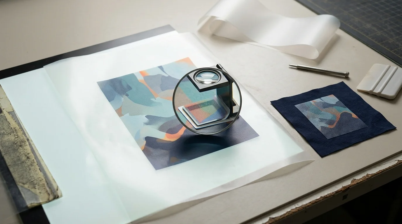
Look at the transfer under magnification before changing settings. A consistent white rim around the entire design points toward underbase size or color-to-white registration. A fringe that appears only around soft shadows, antialiased type, or a removed background is more likely baked into the artwork. A halo that changes direction across the sheet, appears intermittently, or worsens during a run may indicate alignment, media feed, or white-ink delivery rather than the file.
That distinction matters because DTF output is a layered system. Epson describes its direct-to-film workflow as printing color and white ink to film before powdering, curing, and transferring; the white layer is therefore part of the print construction, not just another visible color (Epson DTF Film Guide).
Test 1: inspect the artwork's transparency
Open the production file over at least three backgrounds: white, black, and a saturated color that is absent from the design. Zoom in far enough to inspect individual edge pixels, then review the same edge at final print size. You are looking for partially transparent pixels, a matte left behind by background removal, a pale outline hidden by the usual checkerboard, or a glow and drop shadow that was never intended for print.
A file can look transparent and still contain semitransparent edge color. When the RIP builds a white plate from that alpha information, those edge pixels can produce a faint white shelf beyond the denser CMYK image. Brother's guidance for printing transparency with white ink specifically notes that choke contracts the white layer so it does not protrude from under the color layer (Brother: Printing Transparency with White Ink). Choke is useful, but it cannot make contaminated edge pixels clean.
Before sending the file back to the RIP:
- Remove any accidental background matte rather than erasing more aggressively.
- Review shadows and translucent effects at final print size.
- Check that text and linework have clean alpha edges.
- Preserve an untouched source file before destructive cleanup.
- Export once, then reopen the exported file and inspect it again.
If the design began as a low-resolution JPEG, vectorizing the clean shapes may give you better edges. It will not automatically repair every glow, texture, or soft photographic transition, so inspect the converted result rather than treating SVG as a guarantee.
Test 2: compare the color and white separations
Next, use the RIP preview. View the color output by itself, then the white plate by itself. If the white plate clearly extends beyond the color plate in the preview, the problem exists before ink reaches film.
Do not copy a choke value from a forum and assume it fits every job. The right relationship depends on artwork detail, final size, ink behavior, printer calibration, film, powder, and the RIP's own units. Excessive choke can create dark or translucent edges on thin features because the white support no longer reaches them. Too little can leave the familiar white rim.
Build one small diagnostic sheet instead. Include a solid shape, fine type, a curved edge, a transparent fade, and the troublesome art. Print several versions with clearly labeled, incremental underbase changes. Keep every other setting fixed. This turns a vague visual judgment into a repeatable shop test.
Test 3: rule out printer and process drift
If the plates align in the RIP but not on film, pause the artwork edits. Run the manufacturer's nozzle and alignment checks, confirm the current media setup, and inspect feed consistency. White ink needs particular attention: settling, circulation, clogged nozzles, and uneven density can all change the way the underbase looks. Epson's troubleshooting guidance calls out white-ink maintenance and nozzle checks as core steps when white output is uneven or insufficient (Epson white-ink troubleshooting).
Also separate a registration defect from a finishing defect. Too much heat, inconsistent powder coverage, or a poor press setup may produce a rough or visible edge, but those issues do not necessarily mean the white plate is oversized. Compare the film before powder, after cure, and after pressing when practical.
A fast isolation workflow
Use this order so one correction does not conceal another:
- Inspect the exported art on contrasting backgrounds.
- View color and white plates independently in the RIP.
- Print the same labeled test strip with one underbase variable changed.
- Run nozzle and alignment checks if the RIP preview is clean.
- Compare the film before and after curing and pressing.
- Save the successful preset with the printer, film, powder, and date.
The same habit belongs in a broader DTF file-preparation workflow. It is also worth running before artwork enters a gang sheet, where one dirty edge can be repeated dozens of times.
What PrintCraft AI can and cannot solve
PrintCraft AI's DTF workflow can help you begin with a clearer brief, stronger silhouettes, and fewer unwanted background elements. The downloaded generation is still source artwork, not a finished RIP job. Your shop remains responsible for final size, transparency, the RIP's white plate, printer calibration, and a production test.
That division of labor is healthy. Use AI to get to an intentional design faster. Use prepress controls to prove that the design is ready for your equipment. When a halo appears, diagnose the layer—not the buzzword.
Frequently Asked Questions
Sources and further reading
We use primary documentation and current trade guidance, then apply editorial review for print-production context.
Related Resources
Ready to Develop the Next Artwork Direction?
Build a print-aware creative brief, generate a concept, and keep the project history together for production review.