An SVG Is Not a Screen Print Separation
Vector artwork can be clean and scalable while still being unready for press. Use this preflight to turn an SVG into deliberate screen separations.
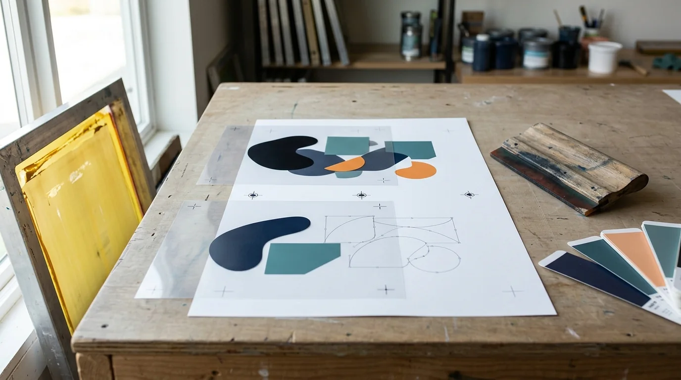
A customer sends an SVG and everyone exhales: finally, vector art. It scales cleanly, the edges look sharp, and the file opens in Illustrator or CorelDRAW. None of that means it is separated for screen printing.
An SVG is a container for graphic instructions. It may contain vector paths, live type, clipping masks, gradients, transparency, filters, linked assets, and even embedded raster images. A color separation is a production decision: which ink prints through which screen, in what order, with what underbase, trap, halftone, and registration relationship.
Those are different jobs.
Vector is geometry; separation is a press plan
Vectorizing artwork can turn a jagged logo into editable paths and make flat shapes easier to select. That is valuable prepress work. It does not decide whether two nearly identical reds should become one spot ink, whether a transparent shadow should become a halftone, or whether a black outline should overprint adjacent colors.
PRINTING United Alliance's guidance on artwork separations frames prepress around the actual output channels and the way artwork is constructed, not the file extension alone (Artwork Separations guide). Current industry education makes the same larger point: predictable reproduction depends on managing color through the whole workflow, from source through output, rather than trusting what looks right on one display (Understanding Color Reproduction).
The six checks an SVG still needs
1. Inventory every real color
Select objects by fill and stroke, then list the colors the file actually contains. Imported art often carries near-duplicates: two blacks, several reds, or an RGB value that looks like the intended spot color but is not assigned as one. Decide which colors become physical inks and consolidate only when the visual result and customer approval allow it.
Name spot colors consistently. "Red," "red-2," and an unnamed RGB swatch invite output errors. The ink list on the job ticket should match the separation names in the file and RIP.
2. Find raster and live effects
Switch to outline view and inspect links or document resources. Look for embedded images, drop shadows, blurs, feathered transparency, pattern fills, and filter effects. Some can be expanded or rasterized deliberately at the correct final size; others need to be rebuilt as printable shapes or halftones.
Do not flatten the whole file merely to make the warning disappear. Preserve editable source art, create a production copy, and document what was converted.
3. Build the underbase intentionally
Dark garments usually require a white underbase beneath some or all top colors. The right underbase is not simply a white duplicate of everything. Its shape, choke, coverage, and relationship to highlights depend on the design, garment, ink system, and desired hand.
Preview the underbase alone, then with each top color. Check thin type, interior counters, distressed texture, and isolated details. An underbase that peeks out becomes a white halo; one that is too small can weaken the top color.
4. Decide where traps and overprints belong
Perfect registration exists in the file, not always on a moving garment. Small overlaps can protect against hairline gaps, while careless overlaps can create dark seams or muddy color. Black keylines are often handled differently from two light adjacent colors. Make the choice based on press behavior, not a universal trap number.
PRINTING United Alliance's artwork-separation guidance emphasizes inspecting how the artwork is built and how each channel will output rather than accepting the composite preview at face value (Artwork Separations guide). Automation can establish a starting point; an experienced separator still decides what the press needs.
5. Match halftones to the shop
If the design uses gradients, photographic detail, or simulated process, the separator needs the shop's target line count, dot shape, angles, mesh, tension, exposure capability, ink, and press tolerance. The familiar mesh-to-LPI rules are starting points, not guarantees; ScreenPrinting.com's technical guidance explicitly relates halftone line count to mesh count (mesh count for halftones).
Ask the production team before output. A beautiful fine-screen preview is useless if the chosen mesh and stencil cannot hold the dot.
6. Output and inspect every plate
Use separation preview, then output a proof or film test. Every screen should contain only the marks intended for that ink plus the correct registration and job information. Check for stray objects outside the artboard, clipped marks, missing strokes, reversed film, live fonts, and unexpectedly rich black.
The 2026 Separation Studio NXT and AccuRIP workflow tutorial shows how current software can organize spot-process separations and film output, but it also demonstrates that separations are a staged production workflow rather than an export checkbox (ScreenPrinting.com tutorial).
A practical handoff package
Do not hand the press operator a single mystery SVG. Package:
- The untouched customer or approved source file.
- The production file with named spot colors and outlined or packaged fonts.
- A composite color proof at final dimensions.
- One labeled preview for each ink plate.
- The print order, garment color, underbase notes, and special ink notes.
- Halftone and mesh assumptions where applicable.
- Customer approval tied to the same revision.
If the artwork came from an AI artwork workflow, apply the same checks. A generator can help create cleaner shapes and a limited visual palette; it does not know your loaded screens, mesh inventory, ink room, or press setup. The screen-printing method guide is a useful design starting point, while separation and film remain shop-controlled production steps.
The reliable rule
Call a file "vector" when its useful artwork is made of scalable paths. Call it "separated" only after every physical ink has a verified output plate. That vocabulary may feel fussy, but it keeps sales, art, prepress, and production talking about the same deliverable—and prevents a clean-looking SVG from becoming an expensive press surprise.
Frequently Asked Questions
Sources and further reading
We use primary documentation and current trade guidance, then apply editorial review for print-production context.
- Artwork Separations Guide — PRINTING United Alliance
- Understanding Color Reproduction — PRINTING United Alliance
- Spot Process Color Separations with Separation Studio NXT and AccuRIP Emerald — ScreenPrinting.com
- What mesh count should I use for halftones? — ScreenPrinting.com
Related Resources
Ready to Develop the Next Artwork Direction?
Build a print-aware creative brief, generate a concept, and keep the project history together for production review.